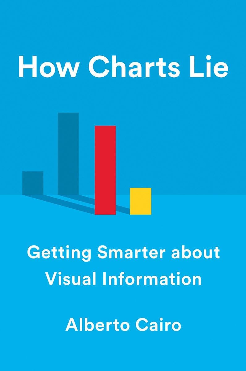
How Charts Lie: Getting Smarter about Visual Information
Product ID: 165027555
Desertcart purchases this item on your behalf and handles shipping, customs, and support to KSA.
A leading data visualization expert explores the negative―and positive―influences that charts have on our perception of truth. We’ve all heard that a picture is worth a thousand words, but what if we don’t understand what we’re looking at? Social media has made charts, infographics, and diagrams ubiquitous―and easier to share than ever. We associate charts with science and reason; the flashy visuals are both appealing and persuasive. Pie charts, maps, bar and line graphs, and scatter plots (to name a few) can better inform us, revealing patterns and trends hidden behind the numbers we encounter in our lives. In short, good charts make us smarter―if we know how to read them. However, they can also lead us astray. Charts lie in a variety of ways―displaying incomplete or inaccurate data, suggesting misleading patterns, and concealing uncertainty―or are frequently misunderstood, such as the confusing cone of uncertainty maps shown on TV every hurricane season. To make matters worse, many of us are ill-equipped to interpret the visuals that politicians, journalists, advertisers, and even our employers present each day, enabling bad actors to easily manipulate them to promote their own agendas. In How Charts Lie , data visualization expert Alberto Cairo teaches us to not only spot the lies in deceptive visuals, but also to take advantage of good ones to understand complex stories. Public conversations are increasingly propelled by numbers, and to make sense of them we must be able to decode and use visual information. By examining contemporary examples ranging from election-result infographics to global GDP maps and box-office record charts, How Charts Lie demystifies an essential new literacy, one that will make us better equipped to navigate our data-driven world. 175 illustrations Review: Should be required reading - This was one of the most enjoyable books I've ever read on data visualization. In this compact volume, Alberto lays out the foundations of 'graphicacy' -- essentially literacy for charts and graphs. The book is broken up into easily digestible sections and written with succinct and precise language, making it an absolute joy to read. Unlike other technical books, I never felt bogged down when reading, and the structure allows you to sit down, take 10 minutes to read a section or two, and come back to it later--perfect for people that are busy and easily distracted (like myself). The book is filled with important and practical advice on how to read and interpret charts and graphs. Not only does it cover the techniques that disingenuous chart makers can use to deceive, but also the mistakes and misinterpretations that even well-educated folks make when reading charts. In the era of mis- and disinformation, when data is quickly becoming a lingua franca, this book is more important than ever, and should be considered required reading for high school students (and adults!) the world over. But while the book is certainly aimed at the layperson, there's valuable information even for seasoned dataviz practitioners. I had an education in science and mathematics, and now I work full time as a researcher/data analyst/dataviz expert and I still found the book quite useful as a summary of common numerical and graphical misconceptions. I learned new information, and I found the book an excellent refresher. TLDR - A top notch book for anyone wanting to be a more informed person. Buy this book, you'll be glad you did. Review: Cairo review - A perfectly timed book, and an accessible one - Alberto Cairo’s latest seems perfectly timed considering the current state of news, media and politics. The book targets itself more to the average consumer of charts rather than data viz professionals, and to that end it contains a lot of examples from politics starting off with variations on the 2016 presidential voting map. It’s a good example to kick off the discussion as it demonstrates in various ways how charts can deceive. The rest of the book is broken down into different ways that charts can lie—either intentionally or not—leaving the reader with the ultimate takeaway to be skeptical of everything. The more successful examples are the ones—like the presidential voting maps—that show the same data presented in different ways. While any data viz pro will recognize a lot of expected topics, there is still some very good in depth coverage of Y-axes, scales, shading, data defining, and omission of data. All covered with accessible and understandable examples—some we’ve seen before and many we haven’t. As always with the author, the book is thoroughly researched and well-notated with an excellent bibliography. If there is a criticism, it might be in the production values of the book. Unlike Cairo’s previous works printed in full, glossy color, this is a 2-color production that forces you to focus more on the words really than the charts. Add to this the smaller form factor, and some of the charts printed all in shades of red and black can be a little hard to read at times. Ultimately the mood feels more academic than previous books, but that’s not necessarily a bad thing. Definitely worth adding to the bookshelf!



| Best Sellers Rank | #879,387 in Books ( See Top 100 in Books ) #23 in Communications #28 in Media Studies (Books) #38 in Business Statistics |
| Customer Reviews | 4.6 out of 5 stars 450 Reviews |
W**E
Should be required reading
This was one of the most enjoyable books I've ever read on data visualization. In this compact volume, Alberto lays out the foundations of 'graphicacy' -- essentially literacy for charts and graphs. The book is broken up into easily digestible sections and written with succinct and precise language, making it an absolute joy to read. Unlike other technical books, I never felt bogged down when reading, and the structure allows you to sit down, take 10 minutes to read a section or two, and come back to it later--perfect for people that are busy and easily distracted (like myself). The book is filled with important and practical advice on how to read and interpret charts and graphs. Not only does it cover the techniques that disingenuous chart makers can use to deceive, but also the mistakes and misinterpretations that even well-educated folks make when reading charts. In the era of mis- and disinformation, when data is quickly becoming a lingua franca, this book is more important than ever, and should be considered required reading for high school students (and adults!) the world over. But while the book is certainly aimed at the layperson, there's valuable information even for seasoned dataviz practitioners. I had an education in science and mathematics, and now I work full time as a researcher/data analyst/dataviz expert and I still found the book quite useful as a summary of common numerical and graphical misconceptions. I learned new information, and I found the book an excellent refresher. TLDR - A top notch book for anyone wanting to be a more informed person. Buy this book, you'll be glad you did.
N**S
Cairo review - A perfectly timed book, and an accessible one
Alberto Cairo’s latest seems perfectly timed considering the current state of news, media and politics. The book targets itself more to the average consumer of charts rather than data viz professionals, and to that end it contains a lot of examples from politics starting off with variations on the 2016 presidential voting map. It’s a good example to kick off the discussion as it demonstrates in various ways how charts can deceive. The rest of the book is broken down into different ways that charts can lie—either intentionally or not—leaving the reader with the ultimate takeaway to be skeptical of everything. The more successful examples are the ones—like the presidential voting maps—that show the same data presented in different ways. While any data viz pro will recognize a lot of expected topics, there is still some very good in depth coverage of Y-axes, scales, shading, data defining, and omission of data. All covered with accessible and understandable examples—some we’ve seen before and many we haven’t. As always with the author, the book is thoroughly researched and well-notated with an excellent bibliography. If there is a criticism, it might be in the production values of the book. Unlike Cairo’s previous works printed in full, glossy color, this is a 2-color production that forces you to focus more on the words really than the charts. Add to this the smaller form factor, and some of the charts printed all in shades of red and black can be a little hard to read at times. Ultimately the mood feels more academic than previous books, but that’s not necessarily a bad thing. Definitely worth adding to the bookshelf!
J**R
An Important Lesson for Scientists
More excellence in data visualization and communicating insights from one of the world's best teachers on the topic. Alberto's humanities-based approach: telling stories about data and explaining things in a way non-scientists can understand. While not as earth-shaking as his foundational texts "The Functional Art" and "The Truthful Art," as a veteran of several of his classes and lectures, I think one of the best lessons of this book is a hidden one - at some point, Alberto changed the title from being a shot at the cheeto to something more long lasting and less specifically tied to this era. In channeling his emotions and irritation with the cheeto into a more universal and less intimidating presentation (at least for some), he has brought in more people. More importantly, he has also taught us as scientists to control our emotions and personal views in a profound way. So yes, read this book and ALL the others by Alberto Cairo.
W**H
This is not just a good book, this is an important book
I’m a big fan of Cairo’s work and recommend his two previous books, "The Functional Art" and "The Truthful Art", to people who attend my workshops. Those books are for people who need to create charts and information graphics. With "How Chart Lie", Cairo is targeting a much larger audience. Everyone. Cairo is concerned at how politicians, advertisers, and the media use charts to bamboozle the public. He desperately wants to stop the spread of misinformation and wants you, the reader, to know BS when you see it. As he writes “we all have the civic duty to avoid spreading charts and stories that may be misleading. We must contribute to a healthier informational environment.” Cairo is an entertaining and engaging writer and a superb graphic designer. He’s also a very good teacher and those with any degree of curiosity will learn a great deal from him. Please be assured that the book is not just about how to avoid being duped by charts. There are many uplifting examples where Cairo channels his inner Hans Rosling and shows how much better life can be when we truly see and understand the data. I’m sorry our education system doesn’t require that people take civics classes anymore, and that this isn’t the primary reading material for those classes. We’d have better citizens.
J**I
A must have for pretty much anyone
I am a huge fan of Alberto Cairo so when this book was released, I quickly grabbed a copy. it's taken me awhile to post a review, but didn't take me long to read through the book! It's a fabulous book for anyone especially in these days where we are constantly bombarded with charts and maps in the news. Cairo explains how to read charts and how to best create charts and maps that are clear and easy to understand. If you work with data at all, this book is a must have so you create effective and clear visualizations. Often the best ways to learn is to see how NOT to something - and this book accomplishes that for sure. Reading through the table of contents you can see that he covers all the key points - how charts work, poorly designed charts, dubious data, insufficient data, uncertainty, and misleading patterns. Get this book. You won't regret it. I also highly recommend Alberto Cairo's other books - The Truthful Art and The Functional Art. I've always been a proponent of good data visualization, but it was the Truthful Art book that turned me into a data viz evangelist!
T**D
Required Reading
'How Charts Lie' is the genuinely fantastic third book from one of today's preeminent voices in Data Visualization. Beautifully typeset and presented, Alberto Cairo guides us through the pitfalls of data storytelling with the straightforward tone of a master educator and equips us with the skills to interpret, question, and authenticate the data we see every day from political charts to hurricane maps and beyond. But he doesn't stop there. 'How Charts Lie' also promotes the responsibility of transparency we all bare in the ethical handling of data. A personal highlight is the masterful deconstruction of the twisted data that inspired Dylann Roof to instigate the horrific Emanuel African Methodist Episcopal Church massacre in 2015. Cairo's focus on dubious data is as spellbinding as it is terrifying. It's not all doom and gloom; however, there is a lighter side to the teaching, and I happen to agree with Cairo that Judas Priest *is* the most paradigmatic example of a 'Metal' band. (That said, I am of a certain age, and from England, so my experience in itself may be somewhat biased.) Since reading the book, I've found myself recommending it to every consumer of media (understand: 'everybody'); however—at the very least—'How Charts Lie' should be required reading for every student of data visualization and advertising/marketing/data professional.
E**N
Not the worst but not the best.
Not the worst but not the best. Makes good points and overall an easy read but don't expect to walk away learning much.
X**A
How to be honest in your visual and data reasoning accesible to anyone
Cairo's book is excellent for those interested in how to avoid misreading visualizations. The best thing is how it walks the reader though the process of creating charts, from data to communication. At each step, Cairo warns you of the possible pitfalls using examples, plenty of which are charts misused to advance an agenda. My favorite part are the reworks of those examples: he breaks apart the data, the visualization, and the annotation to build them back up again in an honest way. If you're an expert in visualization, it's a fun read about things you've likely seen yourself. And if you're a researcher and use data, it's a great checklist to be cautious, precise, and concise.
N***
For me, it is a reference book
Excellent work by Alberto Cairo. I have read the book several times and use it as a reference. Like the part about visualizations as a language... and the many examples in there.
A**R
N8ce examples
Must for every data person
M**E
A must read
Alberto Cairo has explained in very good detail, how tweaking charts can portray a different message altogether.
A**O
Useful, inspiring and engaging
An amazing book with amazing examples about how charts can lie to us. Essential for these times in which data can be a two-edged sword. Alberto Cairo never disappoints.
E**T
Revelador. Recomendo
É melhor ler no celular/tablet/Pc precisa do gráfico para entender o raciocínio do autor Valeu a leitura. Muito bom. Revela como devemos olhar para os gráficos como uma ferramenta e não como a tese em si. Recomendo
Trustpilot
3 weeks ago
2 days ago